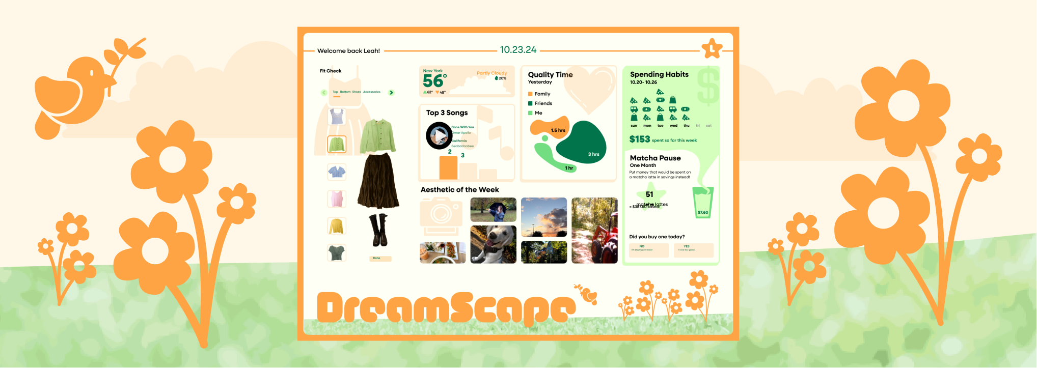
My aim was to craft an engaging design specifically tailored for RIT college students. The primary issue I identified with the original website was its lack of personality. I believed that the news platform should exude a sense of curiosity, enticing students to visit and explore its content.
I chose to incorporate rounded corners and playful shapes to establish a lively layout. However, upon reflection, I recognized that these shapes were diverting attention from the news content and weren't inclusive of all information, particularly longer article titles. As a result, I shifted my approach, reducing the number of shapes and placing greater emphasis on captivating photos. I intentionally selected images with equal quality and intriguing focal points to enhance visual appeal.
This project provided valuable lessons in comprehending content and type hierarchy, emphasizing the significance of understanding user reading habits, which I actively integrated into my design process. It also revealed my passion for UI/UX design, as I found genuine enjoyment in researching user habits and expectations.